First we look at these charts assuming that we know both the mean and the standard deviation of the process, that is μ and σ . These values represent the acceptable values (benchmark values). In the later part we discard this assumption. To get the basic idea of interpreting  charts we consider the above example of Piston India Limited. Mr. Kumar, who is a Quality Control Engineer at Piston India knows that the mean diameter and the standard deviation of the same should be 10.5 cms and 0.02 cms respectively. Since he has to monitor the diameter of the pistons on ten consecutive days, he randomly selects seven pistons on each day and computes their mean (this he does as the diameter of all the pistons manufactured cannot be measured in an exhaustive manner and hence substitution of the sample mean and the standard deviation for population mean and standard deviation). Also from this data he can plot a sampling distribution. The mean and the standard deviation of the sampling distribution will be
|
μ
|
= |
μ |
= |
10.5 |
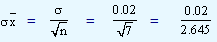 = 0.0075.
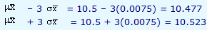
On plotting a chart by taking time variable (in days) on axis and the sample means on Y-axis, we get a chart which is called as chart. In this chart the center line refers to the mean of the sample distribution. In addition to this, we also plot two lines called as upper and lower control limits. The lower control limit is given by  and the upper control limit by
  . To understand why 3 is used, let us recollect that according to Chebyshev's theorem, irrespective of the shape of the distribution, about 89 percent of the values fall within three standard deviations on either side of the sample mean and the same according to the normal distribution is 99.7 percent of the values. In our problem, the lower and upper limits are given by
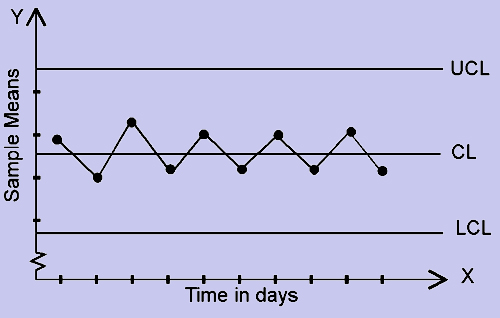
By using the sample means obtained during these ten days, the mean of the sampling distribution and the two limits, we plot the chart and it is shown below. The values plotted are within the lower and the upper control limits indicating that the quality of output is within the acceptable range. The distribution of values does not indicate any trend which may indicate a possibility of crossing the limits in the near future. Hence, when we get a plot like this we conclude that the process is in-control.
Figure 1
Now we look at some of the patterns we generally come across in control charts and their respective interpretations.
Figure 2
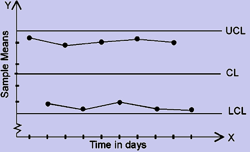
In this chart (fig 2) we observe that some of the points lie outside the upper and lower limits. They are referred to asoutliers. This pattern indicates the presence of systematic variation and it should be set right first to bring the process into 'in-control', before one plans to redesign the whole process.
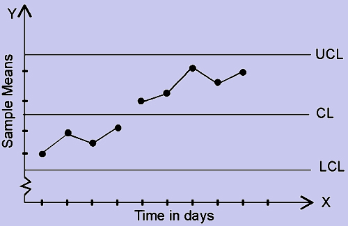
Figure 3
This pattern (fig 3) is usually referred to as increasing trend. Similarly we also have decreasing trend. We observe that there is no randomness in their occurrence. This may be possibly due to the presence of some systematic variation. Although the points fall within the limits, we conclude that process is out of control and the person in charge will do well by investigating for the presence of non-random variation, since there is an indication that the process may go out-of-control.
Figure 4
This pattern (fig 4) is referred to as Cycles. We observe the formation of the waves and a repetition of the pattern above and below the center line at regular intervals. This may indicate the presence of the random variation in the process.
Figure 5
This pattern (fig 5) is referred to as Hugging the Center line. The deviations are minor and uniform in nature. This indicates that the variation has been reduced to a great extent. The personnel should strive to maintain this level and if deemed necessary the width of the limits should be narrowed so that further improvization takes place in the quality of the manufacturing process.
Figure 6
This pattern (fig. 6) is referred to as Hugging the Control Limits. This refers to the deviations being uniform in nature but have large magnitude. This indicates that the means of two different populations are being observed.
Figure 7
This pattern (fig. 7) is referred to as Jumps in the level around which the observations vary. This pattern indicates that the process mean has been shifting.