Correlation - cause and effect, Applied Statistics

Assignment Help:

Cause and Effect

Even a highly significant correlation does not necessarily mean that a cause and effect relationship exists between the two variables. Thus, correlation does not necessarily imply causation or functional relationship though the existence of causation always implies correlation or association between variables. It might sometimes happen that a fair degree of correlation is observed between the two variables but this is only due to chance as the theory might indicate non-existence of cause and effect relationship. Such a correlation is known as spurious correlation. While interpreting the correlation coefficient, it is necessary to see whether there is any cause and effect relationship between the variables under study. If there is no such relationship, the correlation observed is meaningless.

Figure 1

733_cause and effect.png

Ferrochrome is a material used in the manufacture of stainless steel. Suppose, in recent times there has been such a large increase in the supply of ferrochrome worldwide that its international price has dropped.

The simplified figure above reveals that as supply increased from S1 to S2, prices fell from P1 to P2. Hence, there is an inverse correlation between supply and price, that is, when supply increases, prices fall. Further we can say that the increase in supply was the CAUSE that led to the EFFECT of falling prices. So far so good.

Now consider the figure given below:

Figure 2

1313_cause and effect1.png

Here we have plotted supply against price. We may now be tempted to say that the fall in price from P1 to P2 was the CAUSE that led to the EFFECT of increase in supply from S1 to S2. This does not make economic sense because a fall in price does not lead to an increase in supply. The problem is that we have reversed the cause (increase in supply) and the effect (fall in price).

Continuing the example, suppose supply increases from S1 to S2, but demand increases by a disproportionately larger quantity. As demand increases more than supply the price will increase. In such a case if we plot price against supply the simplified graph would be as follows:

Figure 3

1900_cause and effect2.png

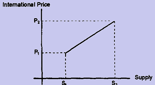
Hence, when supply increases from S1 to S2, price increases from P1 to P2. This is again poor economics because an increase in supply should reduce prices and not increase prices. The problem here is that the main CAUSE for the increase in price is the disproportionate increase in demand which is not shown in the graph. Hence, by ignoring the vital factor of demand and by comparing supply with price we come up with a spurious positive correlation between supply and price which defies good economics.


Related Discussions:- Correlation - cause and effect

Weight distribution, What does the confidence level of a confidence interva...

What does the confidence level of a confidence interval tell you? Suppose that a population has mean, µ, and standard deviation, σ.  What does the central limit theorem tell us

Carpal tunnel statistics, Cindy, the Assistant Vice President of Engineerin...

Cindy, the Assistant Vice President of Engineering/Administrative Services at Blue Cross Blue Shield Rhode Island (BCBSRI), has seen all of the OSHA statistics: In 2000, 1

Systematic sampling, Systematic Sampling In Systematic Sampling ...

Systematic Sampling In Systematic Sampling each element has an equal chance of being selected, but each sample does not have the same chance of being selected. Here,

Estimation error on apparent arbitrage, This question explores the effect o...

This question explores the effect of estimation error on apparent arbitrage opportunities in a controlled simulation setting. We simulate returns for N = 10 assets over T = 30 year

Calculate the maximum weight of the engine, Determine the maximum weight in...

Determine the maximum weight in kN to one decimal point (1 DP) of the engine that can be supported without exceeding the tension given in  Parameter 1 (P1) in chain AB or 1.1 x P1

Box plots, This box plot displays the diversity wfood; the data ranges from...

This box plot displays the diversity wfood; the data ranges from 0.05710 being the minimum value and 0.78900 being the maximum value. The box plot is slightly positively skewed at

Which average is to be used to describe statistical data?, There ar...

There are situations where none of the three averages is fully satisfactory. For example, if the number of items in a series is very small, none of these av

Accident proneness, Accident proneness  A personal psychological issue w...

Accident proneness  A personal psychological issue which affects the individual's probability of suffering the accident. The concept has been studied statistically under the num

Communaiities, The cornlnunalities h j represent the fraction of the tota...

The cornlnunalities h j represent the fraction of the total variance' 'accounted for of variabie j. Ry calculating the communalities we can keep track of how much of-the orig

Calculation for discrete series or ungrouped data , Calculation for Discre...

Calculation for Discrete Series or Ungrouped Data The formula for computing mean is = where,          f  = fr

Write Your Message!

Captcha
Free Assignment Quote

Assured A++ Grade

Get guaranteed satisfaction & time on delivery in every assignment order you paid with us! We ensure premium quality solution document along with free turntin report!

All rights reserved! Copyrights ©2019-2020 ExpertsMind IT Educational Pvt Ltd