Reference no: EM131232525
During this assignment, you will be graded on three dimensions:
1. Your ability to identify the correct analytical tool to use,
2. Your ability to execute the analysis you have selected,
3. Your ability to interpret the results of your analysis
To that end, the assignments will try to reinforce those particular skills by directly targeting these dimensions.
All of your work should be done in the Excel spreadsheet, including your text responses.
Identify
Q1) Examine the data set on the worksheet Q1. This is fictional data from a survey of 500 randomly selected households. A definition for each variable (unless self-explanatory) can be found in the comments section (place your cursor over any cell with a little red triangle - a comment box will pop up). Answer the following:
a) Is this cross-sectional data or timeseries data?
b) Is this a population or a sample?
c) Ignoring the identifier variable Household, state the variable type and sub-type for each variable (categorical and ordinal or nominal, or numerical and discrete or continuous.)
d) If you wished to examine the distribution of the variable Monthly Payment, what would you do? List any graphs and calculations you think appropriate.
Q2) Examine the data set on the worksheet Q2. This shows the percent of children (those under 18 years of age) living below the poverty line in the United States from 1959 to 2008. Answer the following:
a) Is this cross-sectional or timeseries data?
b) Identify the variable type and sub-type for both variables.
c) If you would like examine how successful the United States has been in its efforts to "win the war against poverty" for the nation's children, what type of graph would best answer this question?
Execute
Q3) Create the following graphs.StatTools should place each graph on a new worksheet in your file (if it does not, change the default in Utilities/Application Settings/Placement to Active Workbook.) Don't forget that it is necessary to define the data sets within StatTools (use the option StatTools/Data Set Manager) before you may create a graph.
a) For the data in sheet Q1, create a bar graph for the variable Location. Use the COUNTIF function, you will not need StatTools for this part of the question.
b) Using the data in sheet Q1, create a histogram for the variable Utilities. Don't be afraid to redo it a couple of times (resetting the number of bins or the "span" of the bins) until you get one that is satisfactory and revealing.
c) Again, for data in sheet Q1, create a boxplot with the variable First Income.
d) The data in sheet Q3 contains monthly interest rates on 30-year and 15-year fixed-rate mortgages from 1992-2009. Create a time-series graph that shows both rates on a single graph. Don't forget to use the date as a label.
Q4) The data set in worksheet Q4 lists 204 employees at the (fictional) company Beta Technologies.
Calculate the following values for the variable Salary:
i. The average/mean
ii. The median
iii. The standard deviation
iv. The maximum, minimum, and range
v. The 1st and 3rd quartiles and the inter-quartile range
vi. The salary that 35% of employees earn less than
vii. The salary that 20% of employees earn more than
Interpret
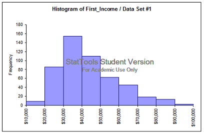
Q5) Examine the graphs shown below. What do you learn from these graphs? What knowledge or information do they communicate? For the histogram, what can you tell us about the distribution of the variableFirst_Income? For the time-series graph, what can you say about trend and seasonal characteristics of the data? It might help if you pretend you are summarizing the results in a few sentences for your boss. Please type your answers in the text boxes provided.
a) Graph 1 (from data set Q1)

b) Graph 2 (this graph shows quarterly sales dollars in billions for Wal-Mart over a 4 year period).

Q6) Interpret the following. What do you learn? What conclusions can you draw? Don't forget to write your answers in the spreadsheet on the Q6 worksheet.
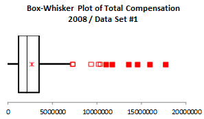
The Wall Street Journal CEO Compensation Study analyzed CEO pay for many US companies with fiscal year 2008 revenue of at least $5 billion. Some summary measures and as a boxplot of the distribution of compensation are shown below. What can you conclude from this analysis?
|
Total Compensation 2008
|
|
One Variable Summary
|
Data Set #1
|
|
Mean
|
$2,704,943.04
|
|
Std. Dev.
|
$2,226,295.52
|
|
Median
|
$2,149,200.00
|
|
Minimum
|
$0.00
|
|
Maximum
|
$17,649,500.00
|
|
Range
|
$17,649,500.00
|
|
Count
|
381
|
|
1st Quartile
|
$1,217,600.00
|
|
3rd Quartile
|
$3,526,300.00
|
|
Interquartile Range
|
$2,308,700.00
|
|
1.00%
|
$0.00
|
|
2.50%
|
$296,900.00
|
|
5.00%
|
$737,500.00
|
|
95.00%
|
$5,963,100.00
|
|
97.50%
|
$7,300,000.00
|
|
99.00%
|
$13,535,000.00
|

Attachment:- Data.rar