Reference no: EM132352765
Assignment -
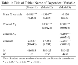
1. For all models in this problem set, report the constants, coefficients, standard errors, and p-values, the N and the R2 values in one table in your write-up. Label them, Model 1, Model 2, etc, as per the example table provided below. When you are finished, you should have 5 models in your table. Use the format of Table 1 as a guide for creating this table in your word document. In the left hand column, your variable names should be included. Name the variables appropriately so a reader would know what it is, but DO NOT USE THE R CODE NAMES. In the columns to the right of the variable names, insert the different models you will make for this problem set. Each cell should contain the values of the coefficients and their standard errors (in parentheses) that are included in that model. Since the first model is bivariate, the only cells that will have numbers will be the primary independent variable (the coefficient with SE's in parentheses underneath), the constant (the coefficient with SE's in parentheses underneath), and the N and R2. Fill the subsequent columns as the problem set instructs.

2. Load the data; it should show you two data-frames. Use c for now. View the data frame and the variables. Make sure you know what each variable is and what it is measuring.
3. Report the descriptive statistics for all the above variables. This includes the type and level of measurement; for categorical variables, provide a properly labeled frequency graph using the freq() command, and include the frequency, and percentage of each category in your write-up; for continuous, provide a histogram using hist() command and report the n, median, mean and standard deviation in your write-up. For the set of categorical variables that indicate regional differences, you will not need to make a graph, but you should consider them here as one category and report their number and frequency. Label each response as 3a-h.
Note: Use the options you used in Problem Set 2 to properly label every graph: this includes the main label, and the x label. Use whatever color you'd like, other than the default color.
4. Your primary interest is the relationship that attractiveness has on the percentage of margin of victory. Create a scatter-plot using the plot() command for these two variables. The syntax for that command is plot (x, y ). Use the label options you used for your histograms and frequency graphs to label the Main Graph label (main = "" ), the x-axis label (xlab = ""), and use y lab = "" to label the y-axis. Put your scatter-plot in your word document and spend a few sentences discussing whether you can distinguish the direction of the relationship between the variables. Be sure to answer the following questions: Is a relationship apparent? What factors might explain why the scatter-plot looks the way it does? Are there any concerns with outliers or leveraging observations? Note: Look in the book to figure out how to identify outliers and leverage.
5. Create a binary regression model using attractiveness and the percent margin of victory and the lm() command. Report the β coefficient for attractiveness and report the standard error and p-value for the coefficient in a table, and label the results Model 1. In your word document, report the statistical and substantive significance. Explain the relationship as you might to a person who is not familiar with statistics, but in such a way that a statistician would recognize what you've done and would appreciate your work.
6. Write the R code necessary to find the R2 for the binary model you just made using the following equation. Report the value, and interpret what this particular R2 value means as you would to someone not familiar with statistics.
R2 = (∑(Yi-Y^)2 - ∑(Yi-Y^i)2)/∑(Yi-Y^)2
7. We may be missing important confounding variable. Perceived candidate attractiveness can be correlated with a variety of other variables that could affect the [percent margin of victory.