Reference no: EM133091537
Libraries and Graphing Data
Question 1: In a new, empty .pyfIle, import the Fraction module (from fractions import Fraction) and then create a Fraction object equal to one-half (i.e. ½).
Then, using a loop - add to this fraction the next 10 values in the sequence 1/4, 1/8, 1/16 etc. Print the new value of the fraction after the addition at each step of the loop.
If you kept on going, would the value of your fraction ever reach 1? Try changing the loop to a bigger value to find out!
Question 2: In a new, empty .pyfile, write a program that imports the plot and show functions frommatplotlib (from pylab import plot, show) and then import Pythons random module, which is part of the standard library, via a the line: import random as rnd
Next, create a list of values called x_valueswhich holds a list of 10 values going from 0 through to 9 - these will be the horizontal values in our graph.
Now create a list of 10 random values within the range 1 to 100 called y_values. You can generate a random value like this: rnd.randint(1, 100). Don't forget you can use the append function on a list to add a new value to the end of it!
Once you have 10 values each in your x_valuesand y_valueslists, you can plot them like this:
show( plot(x_values, y_values) )
Run your program a few times and you will see different graphs each time because of the random values used on the y-axis, for example:

Experimentation: Try increasing the number of plotted points from 10 to 100 or so. Try changing the range of random values down to just two values (0 and 1), or try a large possible range.
Question 3: In a new, empty .pyfile import the following functions from the pyplotmodule:
- plot,
- show,
- title,
- xlabel, and
- ylabel.
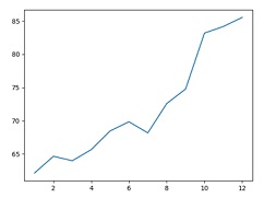
You are provided with the following 12 values which are the share price for Microsoft in US dollars at the end of each month from January to December 2017.
msft_share_prices = [62.14, 64.65, 63.98, 65.65, 68.46, 69.84, 68.17, 72.58, 74.77, 83.18, 84.17, 85.54]
Create a list of 12 values representing the months (1 through 12 inclusive) and plot the month number on the x-axis against the share price on the y-axis. Your plot should look like this:
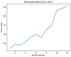
Using, the title function - give the plot a title of "Microsoft Share Price 2017".Using the xlabelfunction give the horizontal axis a label of "Month Number". And using the ylabelfunction give the vertical axis a label of "Price (USD)".Your graph should now look like this:
The price of Apple shares (the company, not the fruit!) is given below:
aapl_share_prices = [136.99, 143.66, 143.65, 152.76, 144.02, 148.73, 164.00, 154.12, 169.04, 171.85, 169.23, 167.43]
Add this second plot to your graph and change the title to read "Microsoft Vs. Apple Share Prices 2017". Your graph should now look like this:
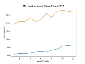
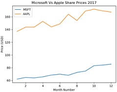
We know that the new line added is the price of Apple shares - but people who look at the graph will not know straight away which one is which - so we need to add a legend to our graph! To do this, add the legend function to list of imports at the top of your code and then modify your plot lines of code for both sets of data to be like this:
plot(msft_share_prices, months, label='MSFT')
plot(aapl_share_prices, months, label='AAPL')
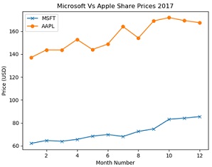
Now, the final thing to do is just call legend() on its own and the legend will be added to the graph, which should now look like this:
Another thing we could do is to add some markers to this graph. There are lots of different marker types we could use and you can add a marker by simple adding a section to your plot statements like marker='x' or marker='o'. When you've done this, your graph should now look like this:
Take a look at the above link to find some different ones to experiment with.
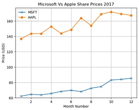
The final thing we'll do is add a grid and align it to round numbers. To do this add gridand ylimto your list of function imports at the top of your code, then add the following code before you display the graph:
msft_min = min(msft_share_prices) # Get minimum Microsoft share price
aapl_min = min(aapl_share_prices) # Get minimum Apple share price
grid_min = min(msft_min, aapl_min) # Get minimum of both of these values
grid_min -= grid_min % 10 # Round down to nearest 10 dollars
ylim(ymin = grid_min) # Apply ymin value to grid y-axis
With this done, our final graph should look like this:
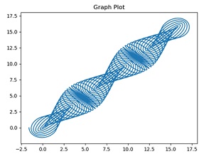
Question 4: Plot the following graph using 2,000 generated values:
# Calculate a step value for each set of x and y values.
# Note: The value 5.0 is related to the number of ‘nodes' you'll see in the graph - try changing this value when it's working!
step = float(index / number_of_values) * 5.0 * 3.14159
x[index] = step - 1.6 * cos(24 * step)
y[index] = step - 1.6 * sin(25 * step)
To use the cos and sin functions you'll need to import the math module and reference them as math.cosand math.sin. Your final graph should look like this:
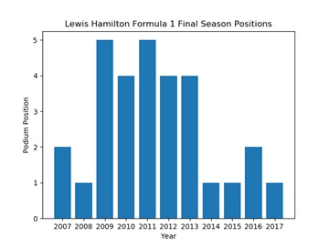
Question 5: Create a vertical (i.e. ‘standard') bar chart which displays Formula 1 driver Lewis Hamilton's final season positions for the last 10 years. Below is a table of his finishing positions:
|
Year
|
2007
|
2008
|
2009
|
2010
|
2011
|
2012
|
2013
|
2014
|
2015
|
2016
|
2017
|
|
Final Position
|
2
|
1
|
5
|
4
|
5
|
4
|
4
|
1
|
1
|
2
|
1
|
Take a look at slides 54 and 55 if you need a reminder on barcharts.Once done, your bar chart should look like this:
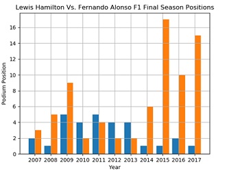
6. Challenge Task: The following are the results of Formula 1 racing driver Fernando Alonso in the years 2017 to 2017:
|
Year
|
2007
|
2008
|
2009
|
2010
|
2011
|
2012
|
2013
|
2014
|
2015
|
2016
|
2017
|
|
Final Position
|
3
|
5
|
9
|
2
|
4
|
2
|
2
|
6
|
17
|
10
|
15
|
Create a bar chart with two bars side-by-side for each year. Take a look at this to see how it's done:
To complete this task, you'll want to import the numpylibrary, and generate the positions range via np.arangerather than the standard Python range function. This will allow you to set the index of each bar at a location which is the position minus the bar width for the left bar, and the position plus the bar width for the right bar.
Then, you can specify the width attribute of each bar to be twice the bar width, i.e. width=(bar_width * 2).
You can also call plt.grid() to add a grid to the chart to make it easier to read.
Attachment:- Libraries and Graphing Data.rar