Reference no: EM132309161
Assignment - Need help with the below statistics questions.
Q1. AM-vs-PM Test Scores: In my AM section of statistics there are 22 students. The scores of Test 1 are given in the table below. The results are ordered lowest to highest to aid in answering the following questions.
|
index
|
1
|
2
|
3
|
4
|
5
|
6
|
7
|
8
|
9
|
10
|
11
|
12
|
13
|
14
|
15
|
16
|
17
|
18
|
19
|
20
|
21
|
22
|
|
score
|
37
|
50
|
58
|
59
|
60
|
64
|
65
|
66
|
68
|
68
|
71
|
74
|
76
|
76
|
79
|
82
|
85
|
88
|
90
|
92
|
94
|
96
|
(a) The value of P90 is.
(b) Complete the 5-number summary.
Minimum =
Q1 =
Q2 =
Q3 =
Maximum =
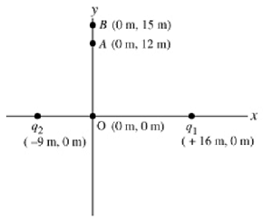
Q2. Quarterbacks: Assume heights and weights are normally distributed with the given means and standard deviations from the table below.
|
Strata
|
Mean Height (inches)
|
Standard Deviation Height (inches)
|
Mean Weight (pounds)
|
Standard Deviation Weight (pounds)
|
|
U.S. Men
|
69.3
|
2.8
|
191
|
28
|
|
U.S. Women
|
64.0
|
2.8
|
145
|
32
|
|
NFL Quarterbacks
|
76.5
|
1.8
|
245
|
25
|
|
Top Female Models
|
70.0
|
2.2
|
115
|
18
|
Tom Brady is a quarterback in the NFL. He is 76 inches tall and weighs 225 pounds. Round your z-scores to 2 decimal places.
(a) With respect to all U.S. men, the z-score for his height is.
(b) With respect to all U.S. men, the z-score for his weight is.
(c) With respect to all U.S. men, would his height be considered unusual?
(d) With respect to all U.S. men, would his weight be considered unusual?
Q3. AM-vs-PM Test Scores: In my PM section of statistics there are 30 students. The scores of Test 1 are given in the table below. The results are ordered lowest to highest to aid in answering the following questions.
|
index
|
1
|
2
|
3
|
4
|
5
|
6
|
7
|
8
|
9
|
10
|
11
|
12
|
13
|
14
|
15
|
|
score
|
42
|
48
|
50
|
52
|
55
|
60
|
61
|
61
|
64
|
65
|
66
|
67
|
68
|
71
|
73
|
|
index
|
16
|
17
|
18
|
19
|
20
|
21
|
22
|
23
|
24
|
25
|
26
|
27
|
28
|
29
|
30
|
|
score
|
75
|
80
|
80
|
81
|
82
|
85
|
87
|
87
|
90
|
92
|
92
|
94
|
95
|
99
|
100
|
(a) The value of P90 is.
(b) Complete the 5-number summary.
Minimum =
Q1 =
Q2 =
Q3 =
Maximum =
Q4. Female Heights: Assume heights and weights are normally distributed variables with means and standard deviations given in the table below.
|
Strata
|
Mean Height (inches)
|
Standard Deviation Height (inches)
|
Mean Weight (pounds)
|
Standard Deviation Weight (pounds)
|
|
U.S. Men
|
69.3
|
2.8
|
191
|
28
|
|
U.S. Women
|
64.0
|
2.9
|
145
|
32
|
|
NFL Quarterbacks
|
76.5
|
1.8
|
245
|
25
|
|
Top Female Models
|
70.0
|
2.2
|
115
|
18
|
You know a U.S. woman who is 73.6 inches tall.
(a) What is the z-score for her height with respect to other U.S. women? Round your answer to 2 decimal places.
(b) Would her height be considered unusual for a U.S. woman?
(c) Would her height be considered unusual with respect to top female models?
Q5. Simpson's Paradox, Exercise -vs- Diet: Averaging across categories can lead to misleading results.
Below is a table for the mean weight lost (in pounds) by moderately (BMI < 40) and severely (BMI > 40) obese participants in a weight loss study over the course of 6 months. Some of these participants employed a diet only plan while others used an exercise only plan.
The bold-faced number gives the mean weight loss in each category (x). The number in parentheses gives the number of participants in each category (w).
|
Mean Weight Loss (# of Participants)
|
|
Extremely Obese
|
Moderately Obese
|
|
Exercise Plan
|
22 (5 participants)
|
17 (45 participants)
|
|
Diet Plan
|
19 (45 participants)
|
12 (5 participants)
|
(a) Under the category of Extremely Obese, which plan was more effective?
(b) Under the category of Moderately Obese, which plan was more effective?
(c) Using a weighted average across both obesity categories, calculate the mean weight loss for those on the Exercise Plan. Round your answer to 1 decimal place.
(d) Using a weighted average across both obesity categories, calculate the mean weight loss for those on the Diet Plan. Round your answer to 1 decimal place.
(e) When averaging across categories, which plan appears more effective?
(f) What made the Diet Plan appear better when averaging across categories?
- The large number of Extremely Obese participants on the Diet Plan.
- The small number of Moderately Obese participants on the Diet Plan.
- Extremely Obese participants lost more weight on average than Moderately Obese participants.
- All of these reasons contributed to the problem.
Q6. GPA: Calculate the GPA for the grades depicted below. The numerical grade equivalents are:
A = 4, B = 3, C = 2, D = 1, F = 0.
|
Credits
|
Grade
|
|
3
|
D
|
|
1
|
C
|
|
3
|
F
|
|
6
|
D
|
|
3
|
F
|
Round your answer to 2 decimal places.
Q7. Simpson's Paradox, Derek -vs- David: Averaging across categories can be misleading but this can be resolved with weighted averages.
In baseball, the batting average is defined as the number of hits divided by the number of times at bat. Below is a table for the batting average for two different players for two different years.
The number in parentheses gives the number of times at bat for each player for each year.
|
Batting Average (# of times at bat)
|
|
1995
|
1996
|
|
Derek
|
0.249 (45 times at bat)
|
0.313 (575 times at bat)
|
|
David
|
0.252 (415 times at bat)
|
0.322 (135 times at bat)
|
(a) What are the averages of the two batting averages for Derek and David
Do NOT use a weighted average, just take the mean of 1995 and 1996 batting averages. Round your answers to 3 decimal places.
(b) Who had the higher average batting average using the non-weighted average?
(c) Using a weighted average, calculate the average batting averages for Derek and David.
Round your answers to 3 decimal places.
(d) Who had the higher average batting average using the weighted average?
(e) What caused the discrepancy in average batting averages?
- Derek's higher average occurred with more times at bat (575).
- David's higher average occurred with fewer times at bat (135).
- Derek's lower batting average was based on a small number of times at bat (45).
- All of these contributed to the discrepancy.
Q8. Average Test Score: Suppose there are three sections of a Statistics course taught by the same instructor. The class averages for each section on Test #1 are displayed in the table below. Use a weighted average to calculate the average test score for all classes combined.
|
Class
|
Class
|
|
Section
|
Size
|
Average
|
|
Section 01
|
9
|
88
|
|
Section 02
|
16
|
75
|
|
Section 03
|
30
|
70
|
Round your answer to 1 decimal place.
Shapes of distributions: An exam is given to students in an introductory statistics course. What is likely to be true of the shape of the histogram of scores if one can say the following about the exam?
(a) The exam is quite easy.
- bimodal
- multimodal
- skewed left
- skewed right
- uniform
(b) The exam is quite hard.
- bimodal
- multimodal
- skewed left
- skewed right
- uniform
(c) Half the students took Calculus last semester. The other half haven't seen any math in several years.
- bimodal
- multimodal
- skewed left
- skewed right
- uniform
Q9. Japanese-Made Cars: Below is a frequency table for the MPG ratings of 261 different Japanese-Made cars.
Japanese-Made Cars
|
MPG
|
Frequency
|
|
9 - 16
|
28
|
|
17 - 24
|
193
|
|
25 - 32
|
37
|
|
33 - 40
|
1
|
|
41 - 48
|
2
|
Round class midpoints to 1 decimal place.
(a) The class midpoint for the first class is.
(b) The class midpoint for the second class is.
(c) Use the frequency table to estimate the mean MPG for all cars in this group. Round your answer to 1 decimal place.
Shapes of distributions: Determine the most likely shape of the histogram representing the data described below.
(a) the shoe sizes of 200 randomly selected adults
- normal
- uniform
- bimodal
- skewed left
- skewed right
(b) the shoe sizes of 200 randomly selected adult men
- normal
- uniform
- bimodal
- skewed left
- skewed right
(c) the shoe sizes of 200 randomly selected males (children included)
- normal
- uniform
- bimodal
- skewed left
- skewed right
Estimating a Mean: Consider the frequency distribution for 12 test scores.
|
Score
|
Frequency
|
|
61 - 70
|
2
|
|
71 - 80
|
4
|
|
81 - 90
|
5
|
|
91 - 100
|
1
|
Round class midpoints to 1 decimal place.
(a) The class midpoint for the first class is.
(b) The class midpoint for the second class is.
(c) Use the frequency table to estimate the mean score. Round your answer to 1 decimal place.
Q10. American-Made Cars: Below is a frequency table for the MPG ratings of 487 different American-Made cars.
American-Made Cars
|
MPG
|
Frequency
|
|
10 - 14
|
86
|
|
15 - 19
|
186
|
|
20 - 24
|
155
|
|
25 - 29
|
54
|
|
30 - 34
|
6
|
(a) The class midpoint for the third class is.
(b) The class midpoint for the fourth class is.
(c) Use the frequency table to estimate the mean MPG for all cars in this group. Round your answer to 1 decimal place.
Q11. Japanese-Made Cars: Complete the cumulative and relative cumulative frequency table from the frequency table for the MPG ratings of 280 different Japanese-Made cars. The cumulative frequencies should be whole numbers. Enter relative cumulative frequencies in percentage form rounded to 1 decimal place.
Japanese-Made Cars
|
MPG
|
Frequency
|
|
9 - 16
|
49
|
|
17 - 24
|
187
|
|
25 - 32
|
41
|
|
33 - 40
|
1
|
|
41 - 48
|
2
|
Japanese-Made Cars
|
MPG
|
Cumulative Frequency
|
Relative Cumulative Frequency
|
|
|
less than 16.5
|
|
|
%
|
|
less than 24.5
|
|
|
%
|
|
less than 32.5
|
|
|
%
|
|
less than 40.5
|
|
|
%
|
|
less than 48.5
|
|
|
%
|
Q12. American-Made Cars: Complete the cumulative and relative cumulative frequency table from the frequency table for the MPG ratings of 467 different American-Made cars. The cumulative frequencies should be whole numbers. Enter relative cumulative frequencies in percentage form rounded to 1 decimal place.
American-Made Cars
|
MPG
|
Frequency
|
|
10 - 14
|
59
|
|
15 - 19
|
171
|
|
20 - 24
|
155
|
|
25 - 29
|
65
|
|
30 - 34
|
17
|
American-Made Cars
|
MPG
|
Cumulative Frequency
|
Relative Cumulative Frequency
|
|
|
less than 14.5
|
|
|
%
|
|
less than 19.5
|
|
|
%
|
|
less than 24.5
|
|
|
%
|
|
less than 29.5
|
|
|
%
|
|
less than 34.5
|
|
|
%
|
Q13. American-Made Cars: Complete the relative frequency table from the frequency table for the MPG ratings of 467 different American-Made cars. Enter your answers in percentage form rounded to 1 decimal place.
American-Made Cars
|
MPG
|
Frequency
|
Relative Frequency
|
|
|
10 - 14
|
55
|
|
%
|
|
15 - 19
|
165
|
|
%
|
|
20 - 24
|
157
|
|
%
|
|
25 - 29
|
73
|
|
%
|
|
30 - 34
|
17
|
|
%
|
Q14. Shapes of Distributions - Variation: The histograms below depict the frequencies from two data sets. These histograms have the same class boundaries and class widths.
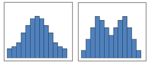
Three of the following statements are true about the statistics from the two data sets. One of them is false. Which one is FALSE?
- The medians are about the same.
- The ranges are about the same.
- The standard deviations are about the same.
- The means are about the same.
Q15. Shapes of Distributions - Variation: Choose the type of distribution which best describes the data depicted in the given histograms.
(a)
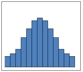
- bimodal
- normal
- skewed left
- skewed right
- uniform
(b)
- bimodal
- normal
- skewed left
- skewed right
- uniform
Q16. Bar Graph - Distorting Data: Consider the bar graph below depicting the percentage of Americans who are in favor of legalizing marijuana divided by region.
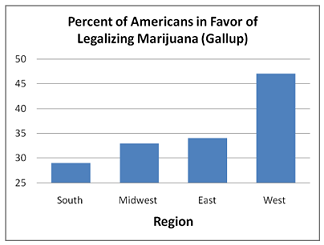
(a) Which one of the following statements is a valid conclusion based on the results depicted in this bar graph?
- The percentage of people who favor legalizing marijuana in the West is more than twice that in the East.
- The percentage of people who favor legalizing marijuana in the West is more than twice that in the Midwest.
- The percentage of people who favor legalizing marijuana in the West is more than twice that in the South.
- None of these are valid conclusions.
(b) What is misleading about this bar graph?
- The y-axis does not start at zero.
- The lengths of the bars are not proportional to the numerical values they represent.
- The differences are greatly exaggerated by the lengths of the bar graphs.
- All of these contribute to the visual distortion of the data.
Q17. Time-Series, Unemployment: The time-series graph below gives the national unemployment rates from the Bureau of Labor and Statistics for the 13 months starting in July 2008 (right at the beginning of the U.S. financial crisis) when unemployment rates started to drastically increase.
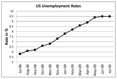
(a) Which one of the following statements is a valid conclusion based on the results depicted in this time-series?
- The unemployment rate more than doubled from July 08 to July 09.
- The unemployment rate more than tripled from July 08 to July 09.
- The unemployment rate more than quadrupled from July 08 to July 09.
- None of these are valid conclusions.
(b) What is misleading about this graph?
- The y-axis does not start at zero.
- The relative differences appear disproportionately large compared to the base-line values.
- Both of these contribute to the visual distortion of the data.